This time around I just chose to keep my page simple and clean.
Here is a posting of the code:
<!DOCTYPE html PUBLIC "-//W3C//DTD XHTML 1.0 Transitional//EN" "http://www.w3.org/TR/xhtml1/DTD/xhtml1-transitional.dtd">
<!--title name for the website-->
<title>Color of Choice</title>
<html xmlns="http://www.w3.org/1999/xhtml">
<style type="text/css">
body,td,th {
font-family: Palatino Linotype, Book Antiqua, Palatino, serif;
font-size: 36pt;
}
body {
margin-right: 5em;
margin-left: 2em;
}
h1 {
font-size: 12pt;
color: #FFF;
}
</style><head>
<meta http-equiv="Content-Type" content="text/html; charset=utf-8" />
</head>
<!--the background color-->
<body bgcolor="#000000" text="#FFFFFF">
<!--the main idea of the page-->
<div align="right">
<h3>BLACK</h3>
</div>
<h1 align="right"> </h1>
<!--The opening paragraph-->
<h1 align="right">For generations upon generations the color black has had a negative meaning amongst the major population in the western countries. On the other hand, many other countries attach positive meanings upon the color. When delving into the true meaning of black, many, if not more than positive aspects erupts into view, though some may say that there has to be a certain level of respect, balancing out the differences when compared to the vast array of colors. This rule especially applies to the equilibrium of black and white, the good and evil, the yin and yang. It is the color of sophistication.</h1>
<h1 align="right"> </h1>
<!--The second paragraph-->
<h1 align="right">Black is not a color, strictly speaking, but the absence of all color. When people speak of opposites, it is usually in terms of black and white. Black, and its opposite white, represents polarities. Black absorbs all aspects of light. While white reveals, black conceals. It has come to mean hidden, fearful or bad experience and is linked to the unknown or the unseen. In times of fear and uncertainty black contains the energy of the threatening unknown. In a positive state, black is seen as a restful emptiness into which anything may emerge and disappear once again. It is also mysterious, providing a sense of potential and possibility.<br>
</h1>
<h1 align="right"> </h1>
<!--The third paragraph-->
<h1 align="right">Black is both positive and negative. In most Western countries black is the color of mourning. Among young people, black is often seen as a color of rebellion. Native Americans believe black was good because it was the color of soil, which gives life. A black cat crossing your path is considered bad luck in many cultures, except for England, where spotting a black cat is considered good luck. Recognition of certain achievements is given to students who are disciplined and skilled with the degree of a black belt in many martial arts, which is considered the highest level within each discipline.</h1>
<h1 align="right"> </h1>
<!--The fourth paragraph-->
<h1 align="right">Black clothing absorbs the sunlight much more than any other colors, but it makes us look physiologically slimmer. Black ties and suits are worn for the look of sophistication and professionalism. It is considered elegant, mysterious and sexy for women whom accessorizes in black fashion. Many super heroes are cloaked in black like Batman, Zorro and The Men in Black. Black is worn in the fashion of power through Judge's robes, limousines and priest's attire. Black gemstones symbolize self control and resilience. Black stones have protective energies in the sense that black is the absence of light, and therefore, can be used to create invisibility.</h1>
<h1 align="right"> </h1>
<!--The concluding paragraph-->
<h1 align="right">So, we can conclude that the meanings of black can differ significantly depending on the human perception. For some, black can be an embodiment of everything dark in life like, death and agony, while for others, it can represent a new beginning. So, the meaning of this unique color depends on the sender, as well as the receiver and that is why I love the color of black.</h1>
</body>
</html>
Eric's Web Design Class
Monday, September 20, 2010
Wednesday, September 15, 2010
Favorite Color: Black
 For generations upon generations the color black has had a negative meaning amongst the major population in the western countries. On the other hand, many other countries attach positive meanings upon the color. When delving into the true meaning of black, many, if not more than positive aspects erupts into view, though some may say that there has to be a certain level of respect, balancing out the differences when compared to the vast array of colors. This rule especially applies to the equilibrium of black and white, the good and evil, the yin and yang. It is the color of sophistication.
Black is not a color, strictly speaking, but the absence of all color. When people speak of opposites, it is usually in terms of black and white. Black, and its opposite white, represents polarities. Black absorbs all aspects of light. While white reveals, black conceals. It has come to mean hidden, fearful or bad experience and is linked to the unknown or the unseen. In times of fear and uncertainty black contains the energy of the threatening unknown. In a positive state, black is seen as a restful emptiness into which anything may emerge and disappear once again. It is also mysterious, providing a sense of potential and possibility.
Black is both positive and negative. In most Western countries black is the color of mourning. Among young people, black is often seen as a color of rebellion. Native Americans believe black was good because it was the color of soil, which gives life. A black cat crossing your path is considered bad luck in many cultures, except for England, where spotting a black cat is considered good luck. Recognition of certain achievements is given to students who are disciplined and skilled with the degree of a black belt in many martial arts, which is considered the highest level within each discipline.
So, we can conclude that the meanings of black can differ significantly depending on the human perception. For some, black can be an embodiment of everything dark in life like, death and agony, while for others, it can represent a new beginning. So, the meaning of this unique color depends on the sender, as well as the receiver.
Monday, September 13, 2010
HTML Linking
Just finished the linking for the haiku and will be posting the html code, then the jpeg on the side.
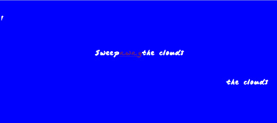
Page 1; this page has the first line of the haiku resting in the middle while two copies of the line are scrolling sideways making them look like clouds and then I used the word "away" as the link for the second page.
 <!--Title heading of the html site.-->
<title> Eric's Haiku with Links page 1</title>
<html>
<!--beginning of the body-->
<body style="background-color:0000FF">
<br/><br/>
<p style="text-align:left;font-family:japanese brush;color:FFFFFF;">
<font size="6"><marquee width=500 height=46 direction=right
scrollamount=8 loop=false>Sweep away</p>
<br/><br/><br/>
<p style="text-align:center;font-family:japanese brush;color:FFFFFF;">
<font size="6">Sweep<a href="file:///C:/Users/Ebichu/Desktop/HAIKU%20+
%20LINKS/Haiku%20page%202.html">away</a>the clouds</p>
<br/><br/>
<p style="text-align:right;font-family:japanese brush;color:FFFFFF;">
<font size="6"><marquee width=500 height=46 direction=right
scrollamount=8 loop=false>the clouds</p>
</html>
Page 2; Not so fancy as the first page, just has the "dome" as the anchor for the next link while having the rest of the text blink.
<!--Title heading of the html site.-->
<title> Eric's Haiku with Links page 2</title>
<html>
<!--beginning of the body-->
<body style="background-color:00FFFF">
<!--spacing for the body-->
<br/><br/><br/>
<br/><br/><br/>
<!--the body of the site with a blinking text effect-->
<p style="text-align:center;font-family:japanese brush;color:0000CD;">
<font size="5"><blink>And let a </blink><font size="9">
<a href="file:///C:/Users/Ebichu/Desktop/HAIKU%20+%20LINKS/Haiku%20page%203.html"
style="text-decoration: none"></a>dome<font size="5">
<blink> of blue sky</blink></p>
</html>
Page 3;For the final page, I gave a title on top as the link back to the first page while having the lines of text emerging upwards to make them look like bubbles in a sea like scenery.
<title> Eric's Haiku with Links page 3</title>
<html>
<body style="background-color:006400">
<p style="text-align:center;font-family:japanese brush;color:00FF66;">
<font size="6"><a href=
"file:///C:/Users/Ebichu/Desktop/HAIKU%20+%20LINKS/Haiku%20page%201.html
"style="text-decoration: none">SEA</a>
<br/>
<font size="6"><marquee width=520 height=400 direction=up
scrollamount=5>Give this sea a name!</p>
<p style="text-align:left;font-family:japanese brush;color:00FF66;">
<font size="6"><marquee width=2000 height=230 direction=up
scrolldelay="90">Give this sea a name!
Give this sea a name!</p>
Page 1; this page has the first line of the haiku resting in the middle while two copies of the line are scrolling sideways making them look like clouds and then I used the word "away" as the link for the second page.
 <!--Title heading of the html site.-->
<title> Eric's Haiku with Links page 1</title>
<html>
<!--beginning of the body-->
<body style="background-color:0000FF">
<br/><br/>
<p style="text-align:left;font-family:japanese brush;color:FFFFFF;">
<font size="6"><marquee width=500 height=46 direction=right
scrollamount=8 loop=false>Sweep away</p>
<br/><br/><br/>
<p style="text-align:center;font-family:japanese brush;color:FFFFFF;">
<font size="6">Sweep<a href="file:///C:/Users/Ebichu/Desktop/HAIKU%20+
%20LINKS/Haiku%20page%202.html">away</a>the clouds</p>
<br/><br/>
<p style="text-align:right;font-family:japanese brush;color:FFFFFF;">
<font size="6"><marquee width=500 height=46 direction=right
scrollamount=8 loop=false>the clouds</p>
</html>
Page 2; Not so fancy as the first page, just has the "dome" as the anchor for the next link while having the rest of the text blink.
<!--Title heading of the html site.-->
<title> Eric's Haiku with Links page 2</title>
<html>
<!--beginning of the body-->
<body style="background-color:00FFFF">
<!--spacing for the body-->
<br/><br/><br/>
<br/><br/><br/>
<!--the body of the site with a blinking text effect-->
<p style="text-align:center;font-family:japanese brush;color:0000CD;">
<font size="5"><blink>And let a </blink><font size="9">
<a href="file:///C:/Users/Ebichu/Desktop/HAIKU%20+%20LINKS/Haiku%20page%203.html"
style="text-decoration: none"></a>dome<font size="5">
<blink> of blue sky</blink></p>
</html>
Page 3;For the final page, I gave a title on top as the link back to the first page while having the lines of text emerging upwards to make them look like bubbles in a sea like scenery.
<title> Eric's Haiku with Links page 3</title>
<html>
<body style="background-color:006400">
<p style="text-align:center;font-family:japanese brush;color:00FF66;">
<font size="6"><a href=
"file:///C:/Users/Ebichu/Desktop/HAIKU%20+%20LINKS/Haiku%20page%201.html
"style="text-decoration: none">SEA</a>
<br/>
<font size="6"><marquee width=520 height=400 direction=up
scrollamount=5>Give this sea a name!</p>
<p style="text-align:left;font-family:japanese brush;color:00FF66;">
<font size="6"><marquee width=2000 height=230 direction=up
scrolldelay="90">Give this sea a name!
Give this sea a name!</p>
Monday, September 6, 2010
First HTML Design
After having to work extra hours at my job during the week and trying to catch up with all of my homework, I finally finished this page. Unfortunately though, at one point I was nearly finished and saved the file as an .html and not as an .txt file and my comp crashed, forcing me to figure it out from scratch and in total I think I spent about roughly 6 to 7 hours.
I picked the poem and created the text with the background, but I wasn't satisfied with it so I looked up some tutorial online to see if I could animate the text and I found them on sites like http://www.youtube.com/watch?v=IQlCEsrh5wo and http://www.hscripts.com/.
The end product had "the clouds" on the first line scroll to the right while the whole third row would scroll upwards toward the poem.
Monday, August 30, 2010
Great Web Sites, Bad Web Sites
For the first site, I already knew right off the bat as to what I was going to choose and that site is www.tokyoplastic.com. I love this site due to its simple navigation and unique design. The best part is of course the interactive flash design composed with the site.
For the second best site I had to do a little research on Google and couldn't find anything that I liked so as I started to ponder about it, I remembered when Ms. Willcock mentioned how she loved architecture in class and made me remember how I also love going to certain sites like www.ikea.com/us/en/ for the ease of navigation, great use of working with the grid system and the strong use of various color schemes.
For the bad websites, I couldn't think of any so I did some more research on Google and found a couple of really, really bad ones.
My first choice was www.proactivechiropractic.org, due to it's horrible use of the grid system and the lack of text justification..
My second choice was http://cbm-eureka.com/, mainly due to the lack of an actual design, the uneasy feeling of boredom that this site gives off and the improper use of negative space.
Subscribe to:
Comments (Atom)


